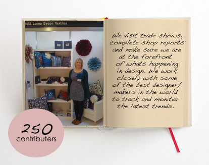
Below is taken from the blog of the trend bible. They visited me at the BCTF show in harrogate.
It feels great to be used in their blog and spotted by a second trend predition company! I'm also pretty chuffed that I'm wearing a very similar pair of brown brouges in my picture which can also be seen in their trend preditions for 2010/2011
Trends: A/W 11/12 Home Trends, Behind the scenes…
Blood, sweat and tears go into producing our seasonal trend forecasting manuals…we’ve been working on our Autumn Winter 2011/12 Home Interiors book for the past 3 months, researching the key social and cultural trend ‘drivers’ that underpin the trends, hosting colour forecasting panels and sourcing up-and-coming textile and wallpaper manufacturers to feature in our forecasts. We work 20 months ahead of the season and sell our forecasting manuals to interior designers, brands, retailers and manufacturers in over 18 countries. Our forecasts help our clients build effective forward-thinking strategies, understand shifts in consumer behaviour and have confidence in selecting the right colours, materials and prints to enhance their product ranges.
We thought we’d bring you some exclusive behind the scenes photos and explain the painstaking processes and methods we go through to create our unique books…We will soon publish a preview of each of our four trends for winter;Perfected, Utilitarian, Geographique and Alpine Shelter in association with FashionMag.com.
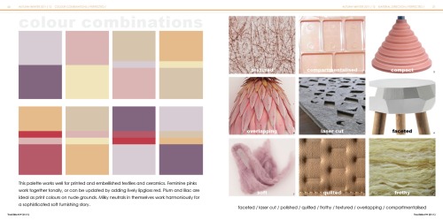
“Pastels are big for interiors for 2011, which is unusual for a winter season that would ordinarily focus on darker colours,” explains Trend Bible Creative Director, Joanna Feeley. “This look isn’t about mixing typical peppermint, baby blue, sugary pink and lemon, but about a more sophisticated palette of tinted neutrals. We love buttermilk yellow and apricot which look great in woolly mohairs, felted wools and plush velvets. We’ve included these colours in our Perfected story for winter.”
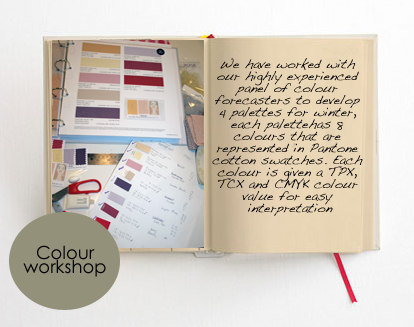
We have worked with our highly experienced panel of colour forecasters to develop 4 palettes for winter, each palette has 8 colours that are represented in Pantone cotton swatches. Each colour is given a TPX, TCX and CMYK colour value for easy interpretation.” We only include the key fashion and highlight colours in our palettes, believing our customers have core colours they like to carry over from season to season,” explains Joanna. “Our Pantone colour swatches are presented on mini palette cards which allow users to remove the swatches for colour matching and palette creation- it’s really important to us that our books are as user-friendly as possible so little features like this make it a versatile design tool.“
We work with our panel of ’unusual and inspiring thinkers’ to develop themes based on future social and cultural drivers. The Trend Bible team then edit and refine this information, creating 4 commercial trends dedicated to home interiors. We then host a seasonal colour panel inviting key colourists and forecasters to share their research, thoughts and ideas. This work underpins our trends for the season. We have a database of over 4,000 designer-makers who keep us up-to-date on their latest designs and products, so we’re constantly seeking out newness and finding the individuals that pioneer change and innovation. We share the contact details of every designer we feature in our Credits section, so that our customers can contact our contributors directly for more information. This makes our books indispensable design tools for interior designers. 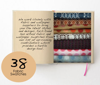

Our fabric contributors range from large manufacturers through to niche designer-makers. We spend much of the year travelling to trade showsand craft fairs, graduate events and textile exhibitions to source the latest talent for our forecasts. This season we feature fabrics and wallpapers from MissPrint, Melin Tregwent and Madison and Grow to name a few. Each of our four stories has a fabric hanger page that shows eight key prints and materials for each theme. Each fabric is hand-cut in-house by our team- there are lots of blisters to show for it! “This year we’ve been to several shows including Maison in Paris, the British Craft fair in Harrogate, Top Drawer and Spring Fair, Birmingham. We’ve included the top picks from these shows in our forecasts which helps buyers really see the trends start to come alive,” explains Victoria Buchanan, Trend Bible design assistant.
Here are a couple of sample pages from our Autumn Winter 2011/12 book, the first shows our Colour Combinations and Key Materials pages from the PErfected story.
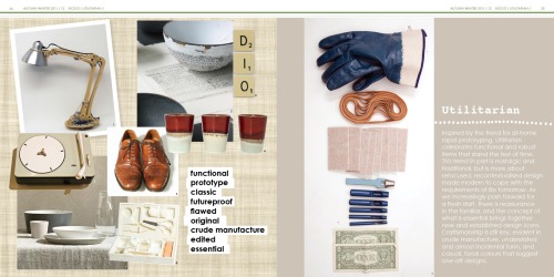
Below is a mood page from our Utilitarian trend for Autumn Winter 2011/12.
Trend Bible trend books help you gain an understanding of where the trends have come from, which colours and materials will be important and how you can commercially interpret each look. For your indispensable design tool, email us atenquiries@trendbible.co.uk for regional agents, appointments, pricing and order enquiries.

No comments:
Post a Comment